
It’s the default object in 3D S Max
LazaroFilm
- 33 Posts
- 889 Comments
Joined 2 years ago
Cake day: June 10th, 2023
You are not logged in. If you use a Fediverse account that is able to follow users, you can follow this user.
 1·2 years ago
Make parts pairing a free procedure by law with minimum required process and anyone can request it. Now Apple gets to keep their “security” bs argument and repairs can be done by anyone and paired by Apple for free.
 1·2 years ago
That’s hilarious!
 3·2 years ago
That’s my point. Example, meet Sarah. Sarah goes to www.megacorp.com to pair her new MegaDevice via NFC. She gets to the pairing page and there’s only a small banner that tells her her browser may not work. She doesn’t see it and starts the syncing. It fails repeatedly. Her first thought will be “O… Mygod! mergacorp’s website is like, so. Broken!” Now example B: Sarah goes to the website and sees “WRONG BROWSER, use chrome instead” on the screen in big. Now Sarah thinks “Oh, I’m stupid, it’s my bad, I should use Chrome instead instead of Firefox. Firefox is the worst”. Then end.
 5·2 years ago
The idea is more like a tug boat and a tanker than two buses.
It’s in the baguette sandwich.
Because that would reveal that their site is flawed, instead of blaming the customer for not using the right browser.
Business days.
Then it’s not a place worth working at
Yes, AR analyses your world and you and gives you more info about the reality, Mixed Reality just has your screens attend into the world without interacting with it. The only thing I saw that was really AR was the use with a MacBook as a screen.
Remember the Google Glassholes?
Companies like chrome because it’s the most used browser. So if they develop for it, and only for it without caring of compatibility on others, then it’s cheaper. And since they don’t want you to use another browser and complain that their site is broken, the just block you.
I bet it’s Automated Irrigation, also known as AI.
I bet you can get it on Etsy.
 2·2 years ago
Lemmy
 3·2 years ago
Or maybe it’s breast have to send…
I can but we’ll need to re negotiate my salary.

Just a quick on the phone color swap

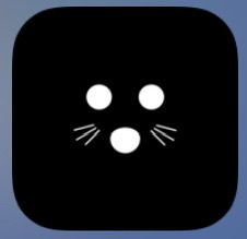
I’ve been thinking about this logo thing over night. The Lights out icon you made for the app as actually super powerful! 3 dots, 2 sets of whiskers and you get immediately what it is. It’s ultra simple and yet easy to identify. You could make your main logo from that. Doing variations on colors and so on. You. An even reduce or even more to 3 dots in that triangular pattern, it doesn’t need to be representing an animal, your app is called Arctic, after all, which doesn’t have to be connected to the rodent image to work. You already have a strong logo!


No line breaks. Just one long line of code.