

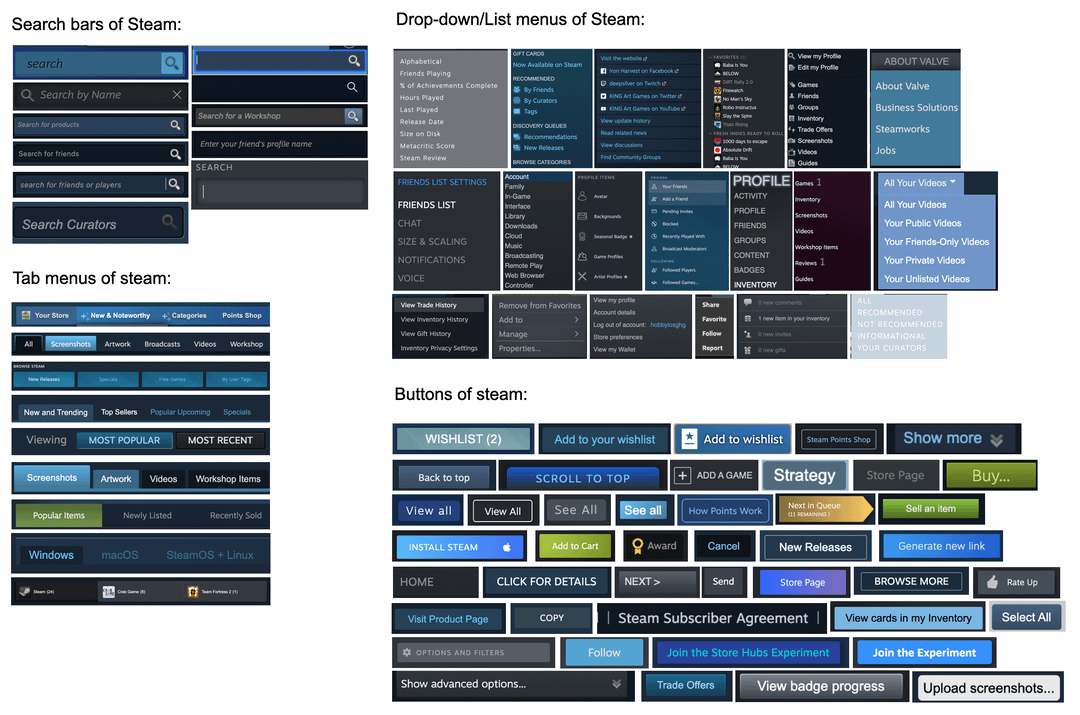
The fact that I never really noticed this for over 10 years of being a decently regular steam user speaks to how generally well put together the UI is, maybe not despite this, but because of this
I agree. The minimalism speaks louder than the accents AND fonts they change it to. The person in charge of that department must know when a good thing doesn’t need too much of a change. Despite it being changed bi-annually, lol.
You know how Half Life and TF2 have almost the same settings menu?
Those two games are almost 10 years apart
Someone should make a game show where you guess what button it is without the text lol.
I think this is better than having a UI that looks like it came straight from Windows 98.
Didn’t they just fix all of this mess a few weeks ago? Or did that just introduce even more inconsistencies?
I’d say they fixed a lot of it but still a lot remains. Going in the right direction though.
I will never unsee this, hahah. Amazing.
I really like the new UI, there are a few glitches… but hey, just give 'em time to fix it.
The design itself is pretty.
This is so funny - I never thought about it before but they’re all so inconsistent! Imagining the work it might take to fix this sounds like a lot though - as long as accessibility is good maybe it doesn’t matter so much.
I kind of like how it’s a time capsule of all the different changes it’s been through
deleted by creator
You should add the error bar that pops up over the window control buttons on the very top of the window as well
Eh, at least it’s clear enough and (hopefully) there’s minimal dark pattern, intentional or not
Their only problem is in consistency where Windows at least has “backwards compatibility” as an excuse though lol
What about the menus opening on the other monitor?
To bring back the older gui on the newest update use the launch command -vgui
To do this on Windows right click your Steam shortcut and go into the properties and put -vgui after what’s written in the Target section, For most people this will be
“C:\Program Files (x86)\Steam\Steam.exe” -vgui
I’d also recommend SFP/SteamFriendsPatcher as it enables a lot more custom theming options.
Dude it’s not like they know anything about graphic design or UI elements I mean their core competency is gaming…OHHhHh


