

You must log in or register to comment.
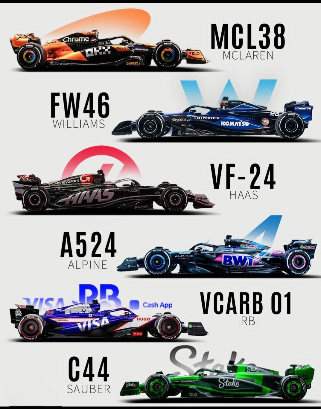
The more I see the sauber, the less I like it. The shade of green is doing some very heavy lifiting here. Because there’s really nothing else.
It stands out from the rest and will be easy to identify on the TV - that’s the most important thing to me
Williams’ livery is great.
My ranking so far:
- Alpine - color pattern and cleanness 👌
- Williams - the smart details are superb
- McLaren / HAAS- gets kind of boring and looks the same every year, but still okay
- RB - would be last if not…
- Sauber - you can argue it’s new and punk, but it just looks like green vomit for me
I could have a grid without the last two. Honestly I don’t even care that Visa is a title sponsor. It is just a terrible name without even a good way to shorten it.
And maybe we could trade in Hass for Andretti?
Torro Rosso has to be the best this year so far
Stake Kicks Sauber is really ugly, and while it’ll be identifiable, it’s not pleasant to look at.
Mclaren/Williams look alright
Alpine I’m going to have to hold judgement on, but it’s so bare that it just looks kinda boring

